Web design and ops case studies
for serious B2B teams
Pipeline, ship dates, clients who stayed and added scope, that’s what earns a case study here. A slick deck on its own doesn’t.
built and launched
qualified leads
expand the engagement
Case studies
CMS migration from a custom-coded site to Webflow, a long-term SEO program, and organic dominance that helped set the table for a strategic acquisition.

Custom WordPress website, content strategy, and SEO for a premier economic consulting firm competing on credibility against industry giants.

Webflow rebuild and WCAG 2.1 AA for a 65-year NYC landscape practice, and we're still their Web Ops partner.

Webflow rebuild with new product architecture, ADA, and multilingual support, with 45% more product quote requests YoY.
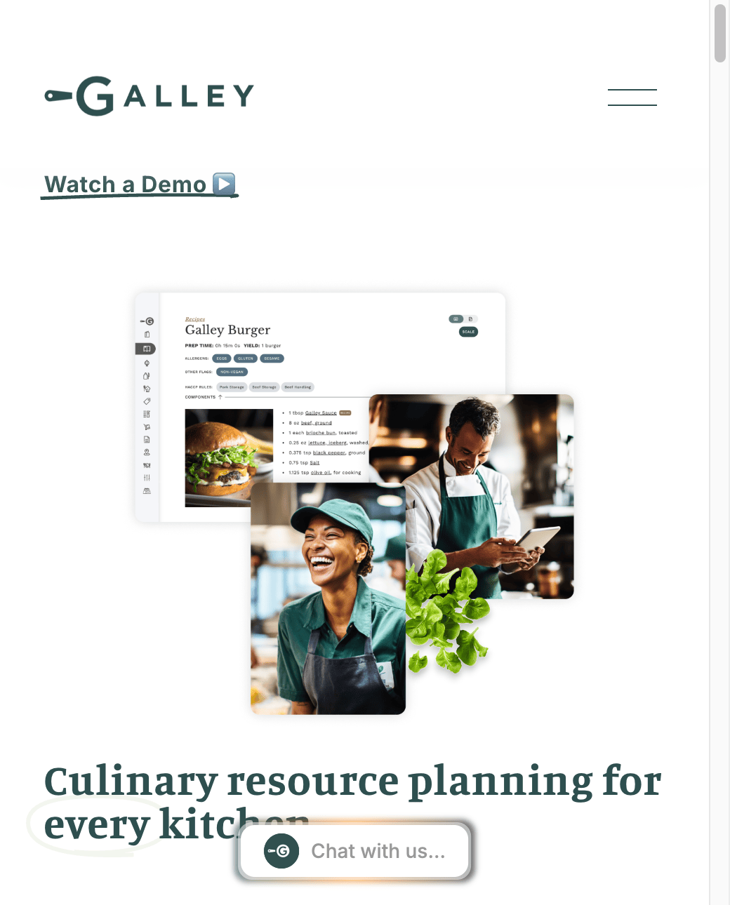
Brand refresh, audience-first sitemap, and WCAG 2.1 AAA for Galley's foodservice CRP platform.
Trusted by B2B companies across industries


"One of the most commendable aspects of working with Dog and Rooster was their ability to adapt and make adjustments as needed. Their commitment to client satisfaction was evident throughout our collaboration."
"D+R has done a great job of helping our firm create and maintain our website. They offer a level of personal and immediate customer service that's been incredibly helpful for a smaller firm such as ours."
"Dog and Rooster not only built a user-friendly online store but also implemented a comprehensive SEO strategy to drive traffic and boost our visibility."
We build for the
sale, not the launch.
Message first
Every project starts with the buyer, their problem, their language, their hesitation. The design follows the message, not the other way around.
Proof in context
Social proof belongs at the moment of doubt, on the pricing page, next to the CTA, inside the contact form. We put it where it does work.
Built to stay current
A site that can't be updated is a site that's slowly becoming wrong. We build foundations that your team can actually maintain.
Your pipeline deserves
a website that earns it.
Every engagement starts with a free audit. We'll tell you exactly what's costing you leads and what to fix first, no strings attached.