A brand, a sitemap, and AAA accessibility, for a platform that serves every kitchen.
Galley Solutions serves chefs, operators, and dietitians through its Culinary Resource Planning (CRP) platform. The site had to carry a refreshed brand, a rebuilt information architecture for three very different audiences, and an accessibility standard that matched the inclusive kitchens the product supports.
Results at a glance
A platform for every kitchen, with a site that didn't show it.
Galley's product is specific, inclusive, and technical. The old site was none of those things.
Galley Solutions serves foodservice professionals, the chefs, operators, and dietitians running modern kitchens. The site had to carry that across three very different audiences, with a brand and an accessibility standard that matched how inclusive the product actually is.
We refreshed the brand so the identity felt as specific as the product, rebuilt the sitemap so each audience lands in its own use case, grounded the photography in real chefs and real kitchens, and took the whole site to WCAG 2.1 Level AAA, one step above the common AA bar. The foundation has held up on its own since launch.
- Brand that didn't match the product the identity leaned generic where the product was specific, so the site didn't carry the confidence of a platform chefs and operators actually rely on day to day.
- Sitemap with no audience path chefs, operators, and dietitians buy Galley for different reasons, but the old site funnelled them through the same generic pages before letting them find their own use case.
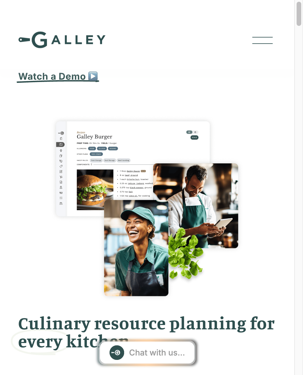
- Visuals that felt like stock real kitchens and real chefs are Galley's proof story. The site was leaning on generic imagery instead.
- Accessibility below the bar for a platform used across commercial kitchens and dietetics workflows, standard common defaults (marginal contrast, inconsistent semantics, keyboard gaps) were not enough.
Refreshed the brand, rebuilt the sitemap,
and raised the site to AAA.
Three moves, run together. Refresh the brand so the identity matched the product, rebuild the IA around how chefs, operators, and dietitians actually buy, and take accessibility one step beyond the standard AA level.
Brand refresh
Tuned Galley's brand guidelines, typography, illustration style, and photography direction so the identity felt as specific as the product. Custom hand-drawn illustrations and real-kitchen photography replaced generic visuals, grounding the brand in Galley's actual customers.
Applied: Brand guidelines · typography · illustration · photographyAudience-first sitemap rebuild
Restructured the navigation around three entry points (Chefs, Operators, Dietitians) so visitors land in their own use case fast. Each path carries the right proof, illustration, and product detail for that audience, without asking them to read past the others.
Applied: Information architecture · audience-led navigationWCAG 2.1 Level AAA build
Took the site one level past standard AA. Colour contrast, keyboard navigation, semantic structure, and content relationships were all built to AAA (the highest WCAG 2.1 conformance level), a meaningful signal for a platform serving diverse culinary teams and dietetics workflows.
Applied: Accessibility audit · AAA implementationOngoing Web Ops after launch
Ran Web Ops and maintenance after launch so new pages, content, and design updates rolled out without degrading the accessibility standard or the brand consistency the launch established.
Applied: Web Ops program · accessibility review loopThe brand, the sitemap, and the AAA build
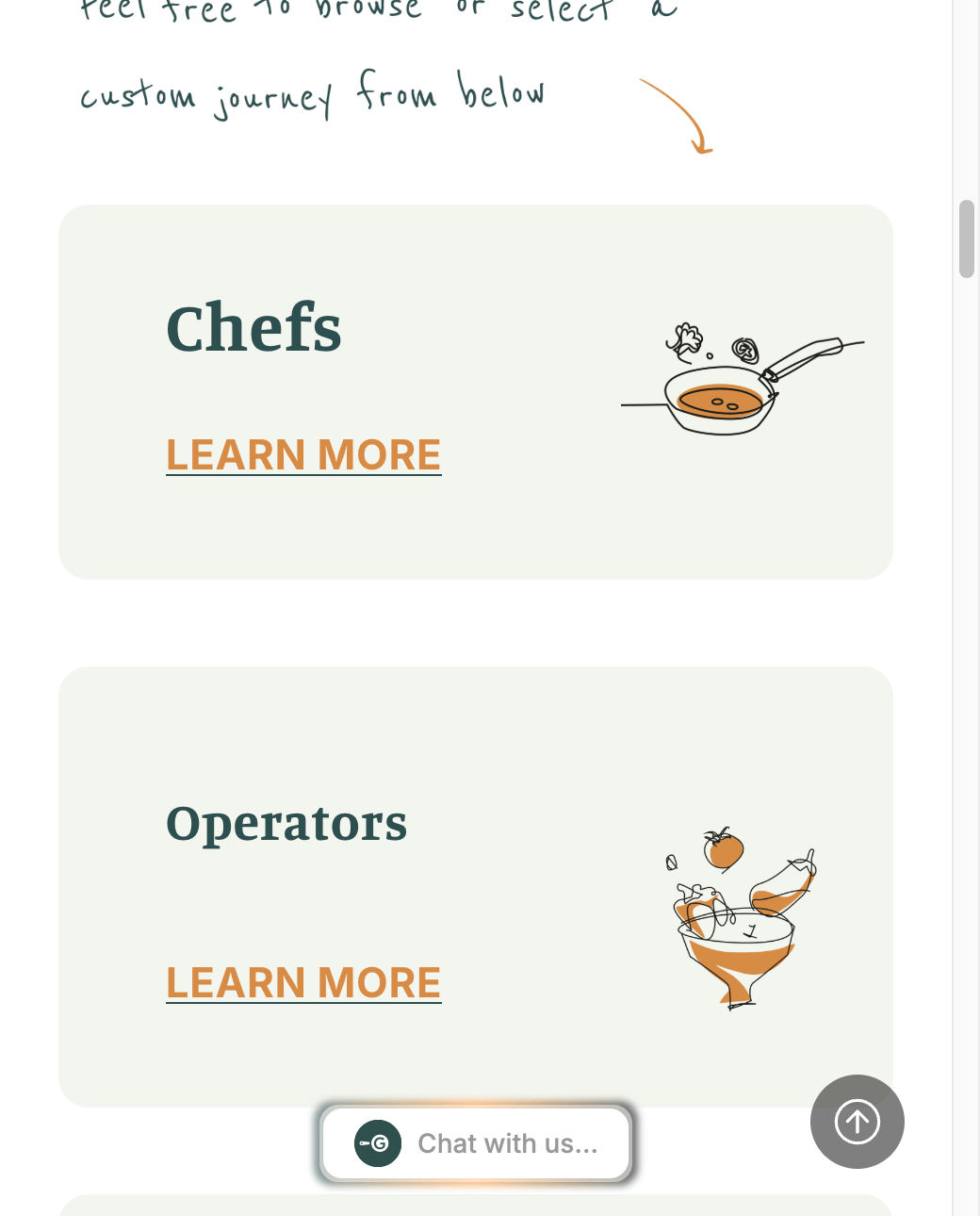 Audience-first sitemap (Chefs · Operators · Dietitians) Rebuilt information architecture
  Brand voice, carried through Refreshed identity and editorial tone
 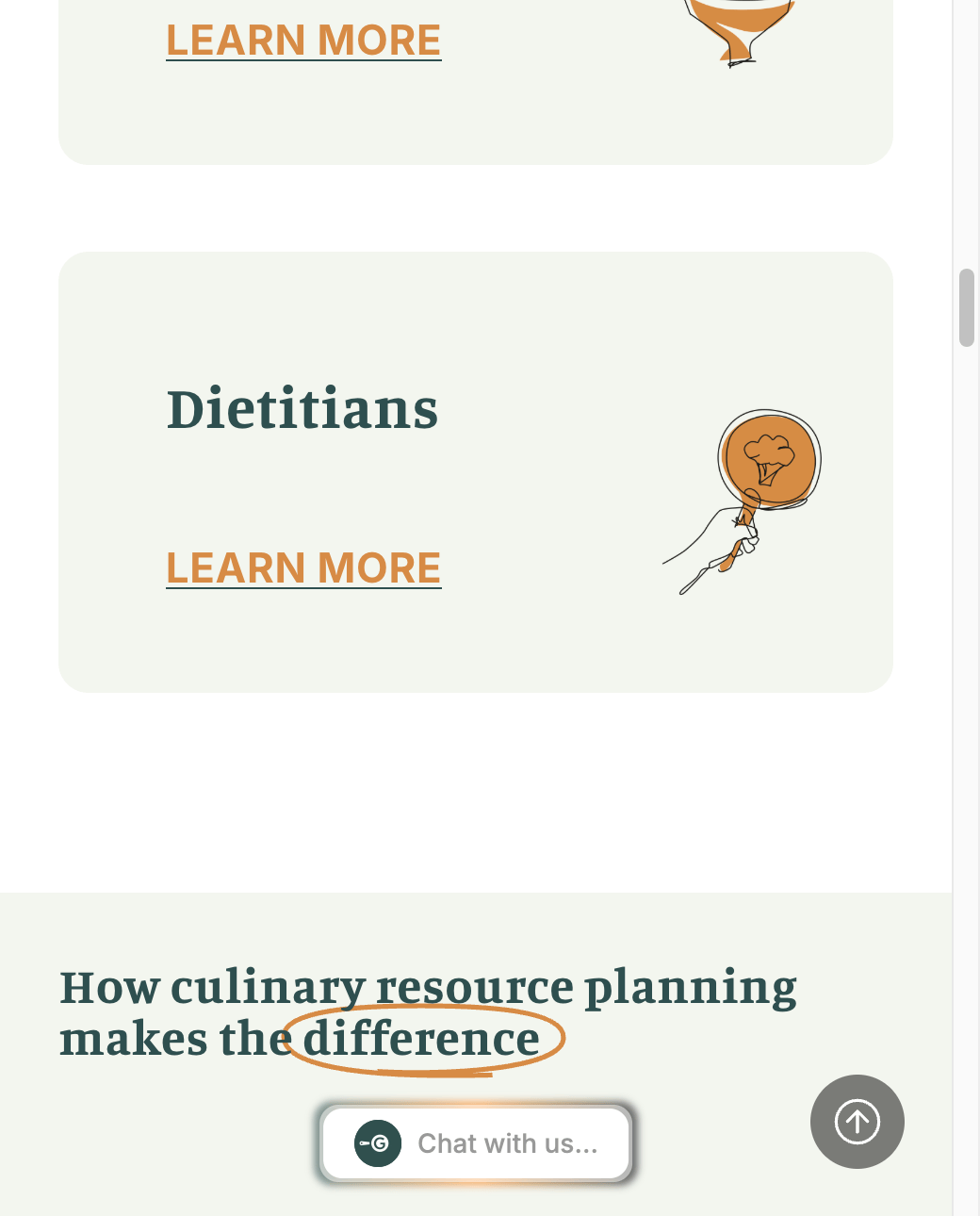 Dietitians path Persona tile, on-brand illustration
 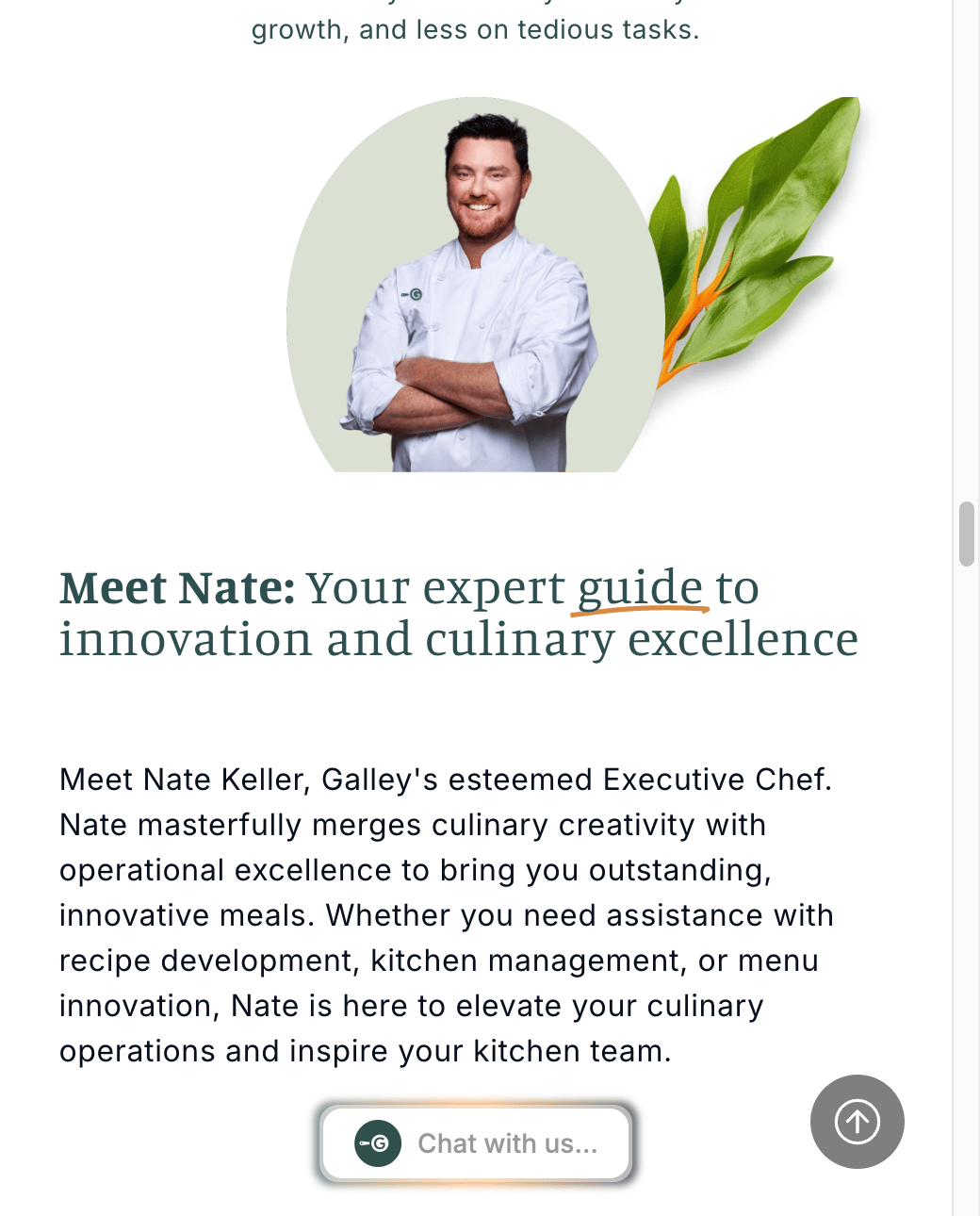 Real-kitchen photography Replaces stock visuals across the site
 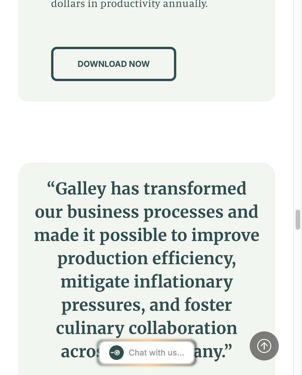 Customer proof, in context Testimonials placed inside the journey
 A platform that reads
as inclusive as it actually is.
AAA accessibility isn't boilerplate for Galley. It matches a product used across kitchens, dietetics, and enterprise foodservice, where real inclusion matters beyond a compliance checkbox.
The sitemap sends chefs, operators, and dietitians to pages that speak to them first. The generic funnel is gone, and the illustration system makes each path feel made for that audience.
Replacing stock visuals with real chefs and real operations grounded the brand and made the product story feel like the ones customers already tell themselves.
More client results
See all case studies →Superior Ready Mix · CMS migration from a custom-coded site to Webflow, a long-term SEO program, and organic do…
Read case study →Hitec Commercial Solutions · Launched their e-commerce store in 2021, still running storefront, catalog, growth, and We…
Read case study →MD-Staff · Full website redesign on WordPress for a B2B healthcare SaaS provider — including a platfo…
Read case study →Your site should be your
best salesperson. Is it?
We'll audit your site for free and tell you exactly what's keeping qualified prospects from reaching out, no pitch deck, no jargon, just a straight answer.